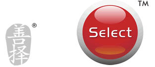
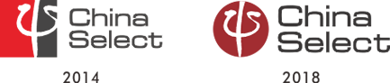
The worldwide Psychology symbal of Ψ is incorporated in the logo, in the form of traditional Chinese caligraphy, which I wrote by myself. It explains the company's business feature while setting up the link with China in the fresh red color.
The select button is abandoned, as it appears to distract attention from the logo. Instead, a more subtle touch of traditional calligraphy strokes have been applied. Generally speaking, China Select looks more "Chinese" now.
In 2018, the logo is finetoned to a Burgendy color and the shape to a circle, to present a lower profile. |